
Aree di competenza:
Art Direction - Graphic Design - Data Visualization
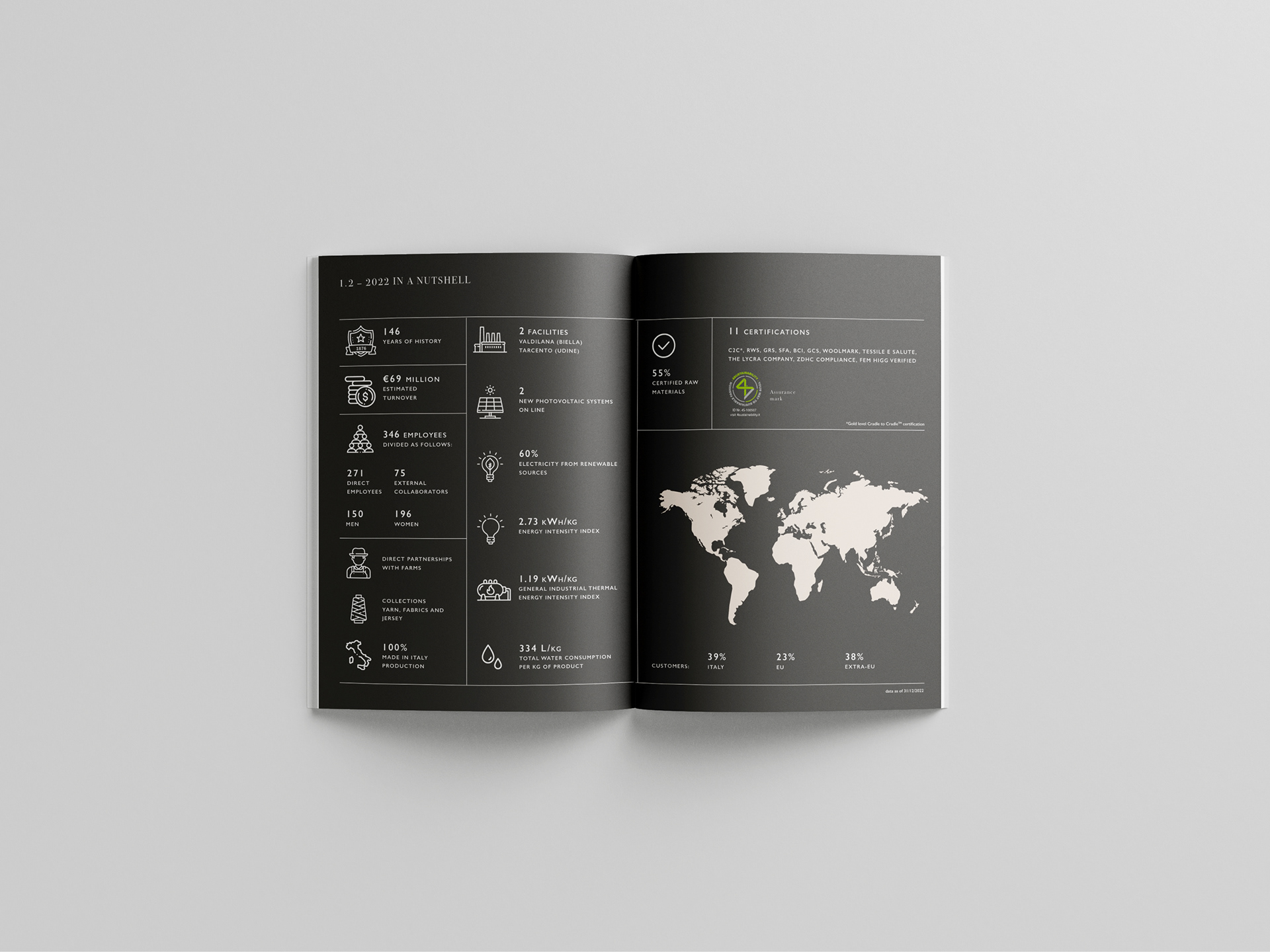
I contenuti di un bilancio di sostenibilità non sono sempre di facile comprensione. La sfida più grande di questo progetto è stato comprendere e analizzare i contenuti per poi facilitarne la lettura e renderla più immediata attravero la grafica e la data visualization.
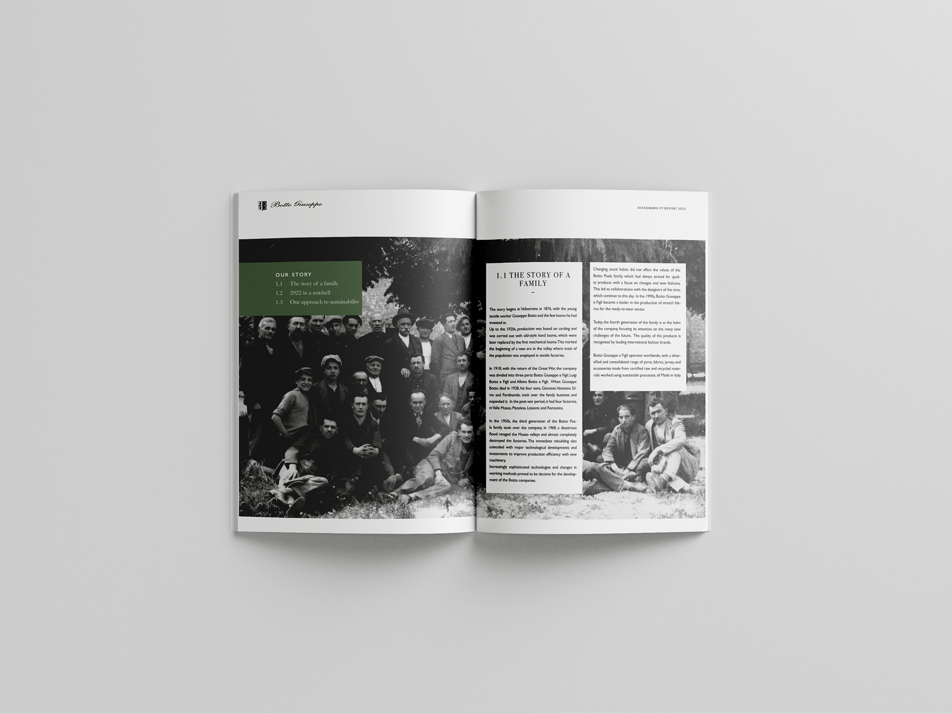
In un bilancio di sostenibilità è sicuramente il contenuto la cosa più importante per cui ho utilizzato colori naturali, fotografia in bianco e nero e un layout pulito, forte ed espressivo. in grado di mettere in risalto gli obiettivi raggiunti dall'azienda.
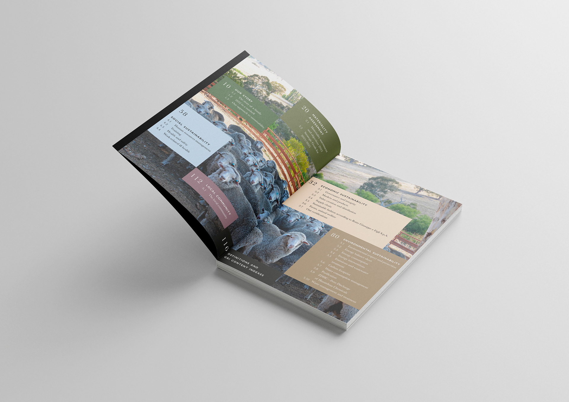
Ogni capitolo ha il colore del macro-argomento di riferimento utilizzato nell'indice in modo da fornire a chi legge un riferimento immediato di dove si trova.